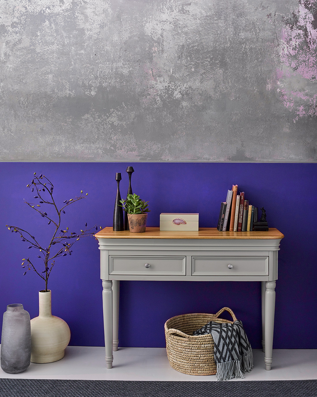
The moment we’ve all been waiting for has finally arrived. Pantone has announced its Colour of the Year 2022, and for the first time ever they have created a brand new shade, Very Peri, especially for the occasion.
The deep and emotional colour encompasses the tones of blue yet is infused with a red-violet undertone that creates a rich, joyful and luxurious shade that hopes to highlight the expansive possibilities of the year ahead, along with sparking creativity and celebrating innovation.
Laurie Pressman, Vice President of the Pantone Colour Institute, says it ‘reflects what is taking place in our global culture, expressing what people are looking for that colour can hope to answer.’
This bright and cheery colour looks equally good paired with our natural oak and warm rustic range, or our painted ranges – so depending on your style, there are plenty of looks to create. Here we show you some tips on incorporating the Colour of the Year into your home.
How to style Very Peri
In your living room
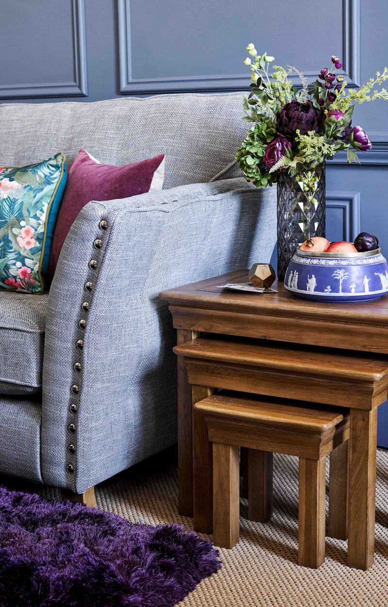
French Farmhouse nest of tables
Embrace Very Peri in your living space with a feature wall that commands attention. A lick of paint and well positioned lighting can make a room pop, highlighting panelling and adding depth and drama to your home. If you can’t commit to permanent colour, embrace soft furnishings or add a Very Peri coloured rug for a touch of luxury.
In your kitchen
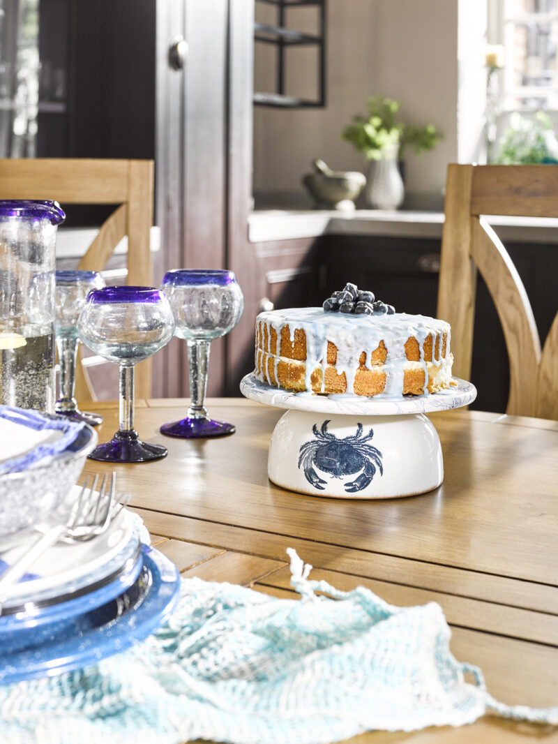
The creative nature of Very Peri makes it the perfect shade to splash across the kitchen. Incorporate Very Peri-coloured tiles into your workspace to encourage an adventurous approach to your cooking.
You can also update your accessories such as storage jars, cutlery, plates and glasses, or even napkins and place settings in a Very Peri colour for subtle, impermanent touches.
In your bedroom
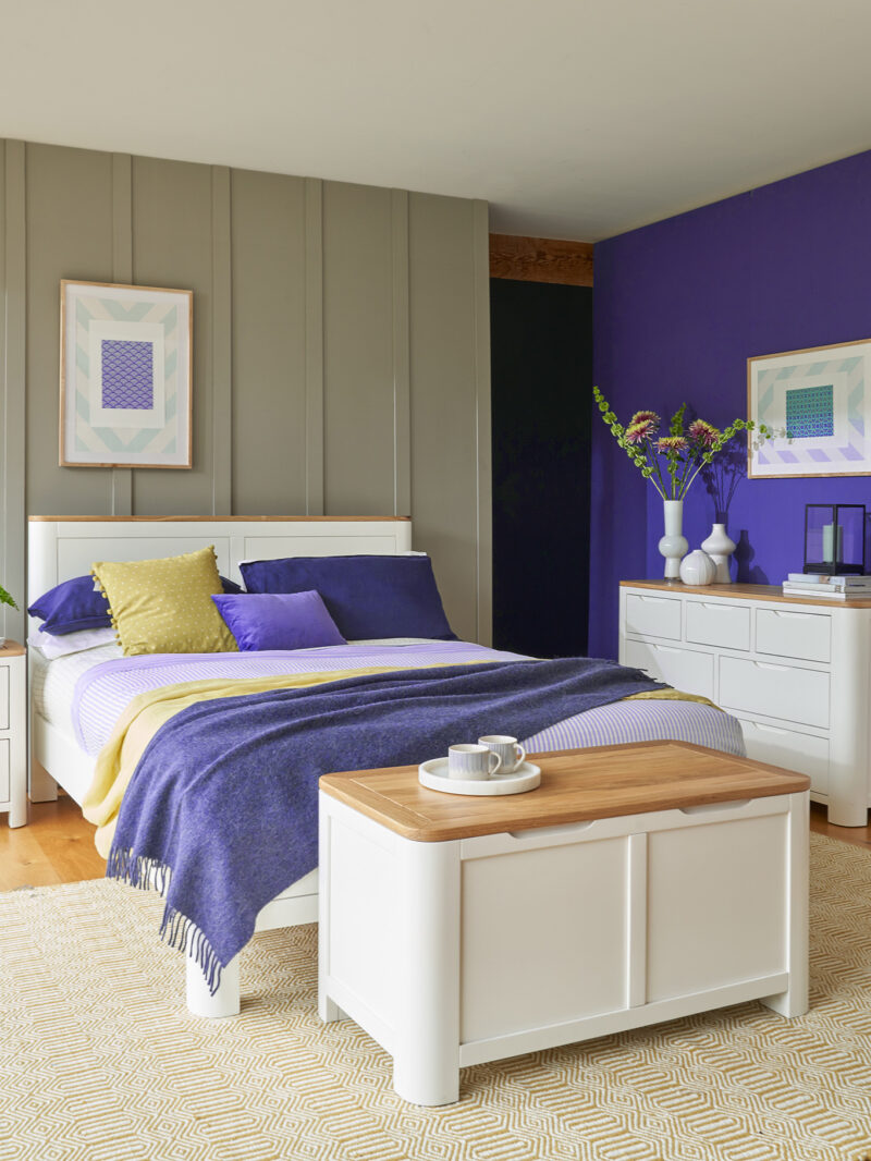
As the room of ultimate relaxation, the bedroom lends itself to comfort and warmth. Invest in soft furnishings such as cushions, blankets and bedding in a Very Peri shade to accessorise the room and to help you unwind into blissful blue. Bedside lamps and ceramics such as vases can also add a colourful touch without overwhelming the space.
What to pair with Very Peri
Neutrals and greys
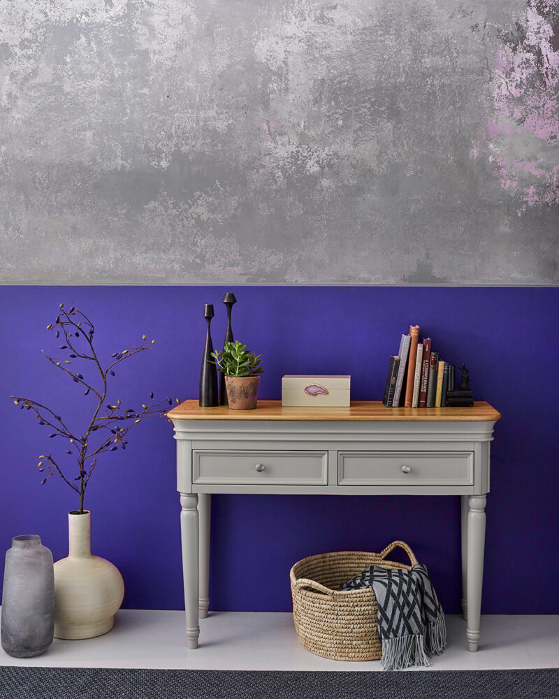
To make your Very Peri really pop, pair it with understated neutrals like stone or cream. The contrast will give the blue shade a dynamic edge within a classic and sophisticated colour palette.
Billowing blues
Run with the theme by slotting Very Peri into a collection of varying blue hues. Place it between a darkened navy and a lighter pearlescent blue to create a harmonious look that celebrates every shade.
Bold and bright
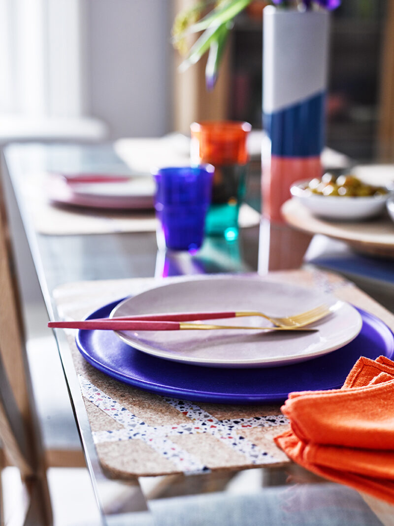
Tell the story of colour with pinks, reds and oranges that teases out the joy and playfulness in Very Peri blue. Pairing colour on colour can help you to create an expressive palette that brings your home to life, particularly in the colder seasons.
Seaside palettes
Bring a taste of the ocean into your home with pale yellows, seafoam greens and stoney silver greys. Add glints of silver and gold for that extra bit of seaside sparkle.
To share your Very Peri styling with us, tag #OakFurnitureland in your Instagram posts. We can’t wait to see how you embrace the colour of 2022.

