We chat with interior designer and editor Charlotte Luxford of Luxford Interiors and Nest Magazine, who shares her knowledge of creating practical and stylish family-friendly homes, whatever your budget. Grab yourself a coffee and read on to find tips and tricks for your latest home decor projects.
Can you tell us a bit about your interiors background?
First and foremost, I’ve forged my career as an interiors writer and editor, having written for magazines for more than a decade. It was only when I started helping friends and family informally with their design projects that I realised how much I enjoyed the creative aspect of designing.
It was a pleasure to put into practice all the knowledge I’d accumulated over the years working for newsstand magazines. I completed a diploma in interior design in 2017 to further my knowledge, launching my interior design business Luxford Interiors in 2018. I regularly work on interior design projects alongside my journalism – I love the variety both professions bring.
How would you describe your style?
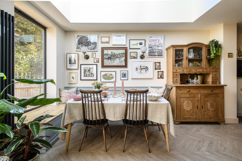
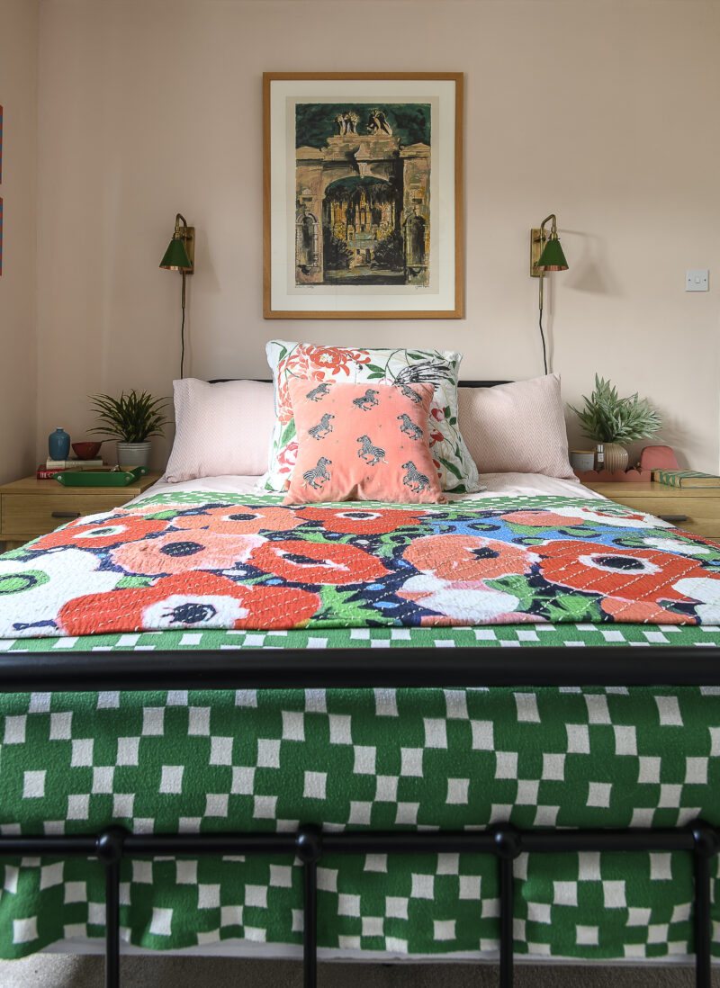
Eclectic, characterful, yet modern. I love to blend old and new styles, but I’m always drawn to the Arts and Crafts movement and Art Deco period. I enjoy playing with colour and pattern and love a pink and green combo!
What’s the best way to approach a room makeover?
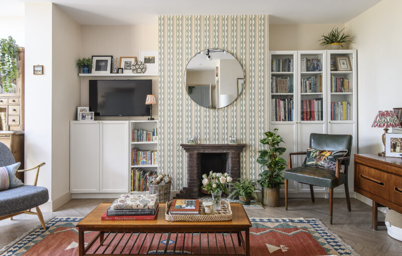
I think it’s essential to have a starting point to inspire your scheme – art is great for this, or perhaps a treasured object, or wallpaper you’ve always loved. Whatever it is, it needs to be something that excites you. It makes it much easier to create a scheme when it’s based on something meaningful.
Extrapolate the colours from your chosen object to start to form your scheme, with a base colour, a complementary colour and then a bold accent shade – to be used sparingly for effect. It’s all about layers; consider using different textures to stop it from looking flat: metallics, glass, matt, gloss, painted, raw rood, velvets, linens, sheers etc.
The same goes for patterns – choose a geometric, floral, stripe and plain as a rough rule of thumb, and ensure you mix large-scale and small-scale print for interest.
It’s also about taking the time to let the interiors evolve and to include personal things that bring you joy – it’s easy to be trend-led, but at the end of the day it needs to feel like your home. Interior designer Billy Baldwin famously said: “Be faithful to your own taste, because nothing you really like is ever out of style.”
How do you create a stylish home on a budget?
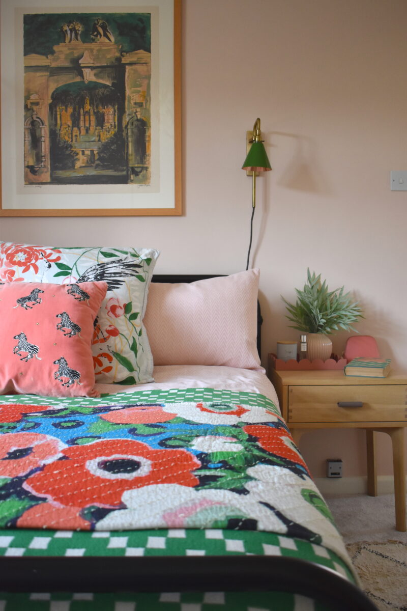
With the current state of the world, I think it’s more important than ever to reuse and rehome wherever possible. Facebook Marketplace can be a real treasure trove; I’ve picked up brand-new designer tiles, vintage furniture, art, lighting and all sorts there.
Same for charity shops and antique markets; plus, shopping this way almost automatically ensures your interior is interesting to look at and bespoke. Upcycling existing pieces is also a great way to give something a fresh look – it’s amazing what a lick of paint or new handles will do.
What’s your advice for creating an aesthetically pleasing yet practical family home?
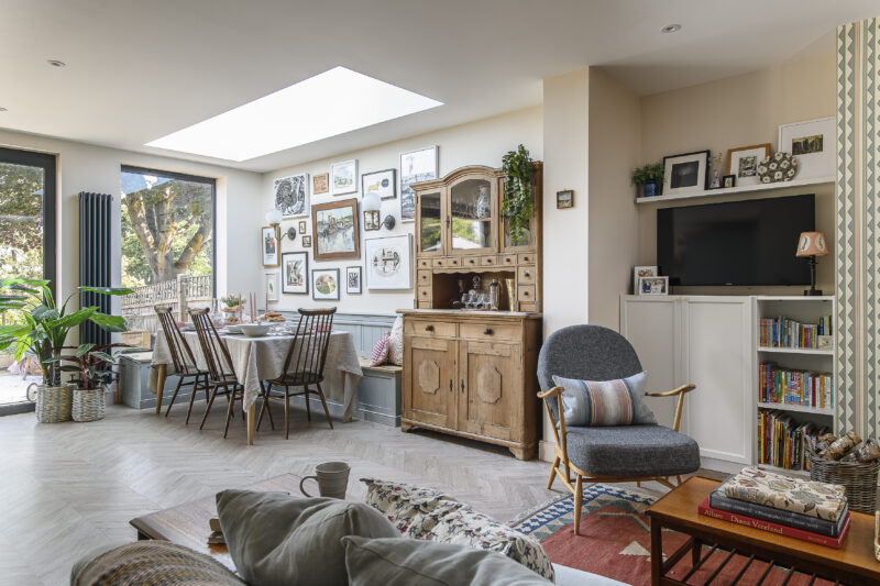
Storage, storage and more storage. Look for opportunities to integrate it wherever you can – I’ve got a huge L-shaped bench seat at home with lift-up lids where I stash the majority of the kids’ toys, plus it saves space and you can get more people around the dining table. Look at dresser units or half-glazed bookcases where you can style the top half with beautiful pieces that stay out of reach of little hands, while the clutter can be concealed behind closed doors on the bottom half.
What are the easiest ways to transform a space?
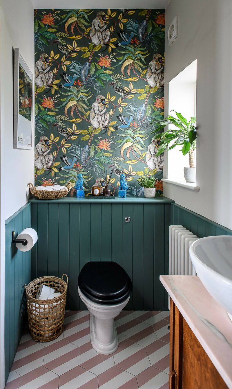
Painting is totally transformative, easy and inexpensive. And get creative with it too – explore ideas such as painting skirting and doors in a bold accent shade, upcycle furniture, or zone spaces with it. Wallpaper is also great; you could add it to the back of a bookcase to make it feel more bespoke, create a feature wall or even paper the ceiling. Adding a focal point, such as a gallery wall, a large statement poster or a mirror can also add the wow factor without much effort.
Getting your lighting right is also super important and can change the vibe of a room completely and make it feel more expensive – layer practical lighting with mood and accent lighting, highlighting features in the room, and place lights at different levels i.e. floor, ceiling and wall lighting for interest. There are now a lot of portable and battery-operated designs on the market that enable you to add lights without expensive rewiring.
Can you tell us about your new magazine, Nest? What’s the concept behind it?
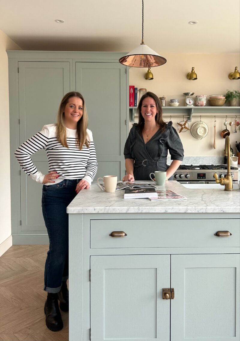
Charlotte Luxford and Sophie Vening
I’ve recently launched @nest_magazine with a friend and fellow journalist Sophie Vening. We wanted to offer an interiors magazine that focuses very specifically on family-friendly homes, architecture and design, with all the crumbs, mud and spillages that go with having children.
Nest isn’t your traditional print magazine either – it’s an Instazine. We felt the format works best for time-poor parents, offering readers quick, easy-to-read features on the go, with stunning inspirational photography.
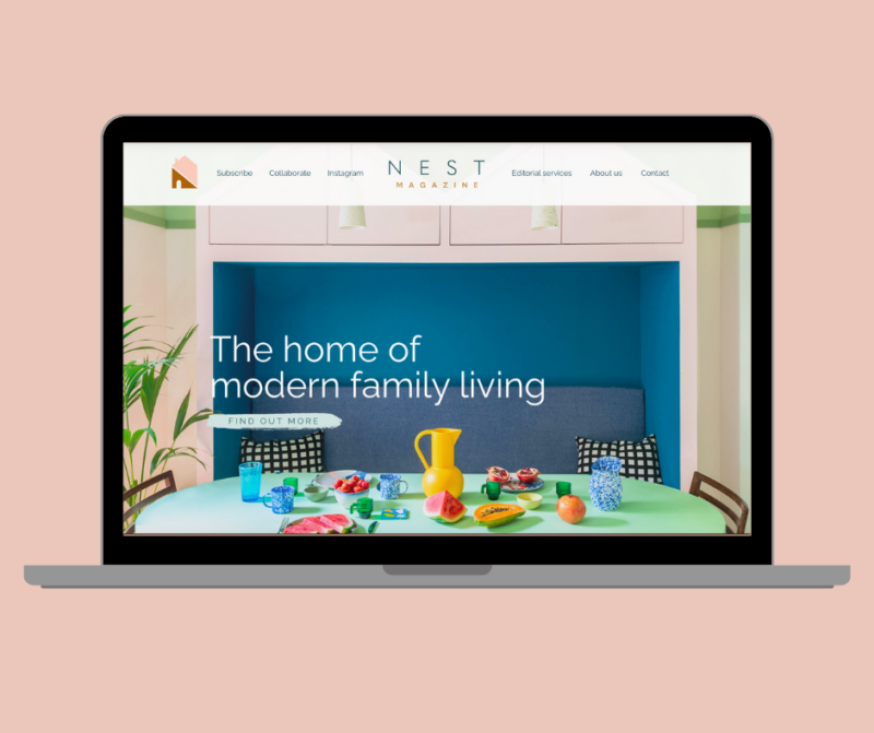
Nest showcases a mix of family-friendly homes, ideas for kid-friendly spaces, smart shopping edits, sustainable design solutions, home hacks and expert advice. For lengthier features, including interviews and in-depth guides, we’ve also set up a free weekly newsletter on Substack.
What makes designing kids’ spaces so fun?

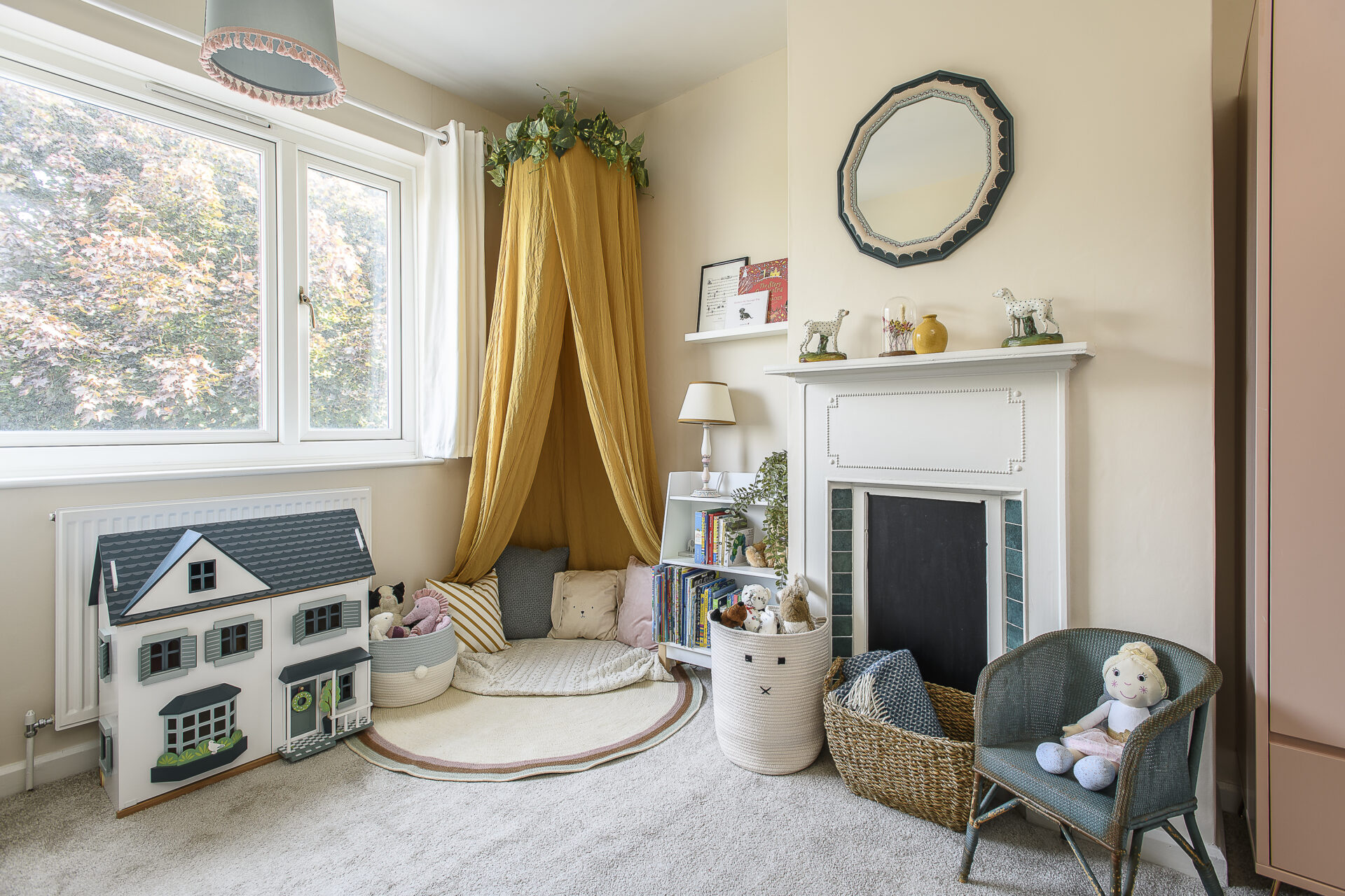
It’s the perfect opportunity to be playful and brave with colour. Plus, you can dare to be more thematic than in other spaces, as it’s likely they’ll get updated more frequently as the child grows.
Things like decals that can easily peel off are a great way to add patterns without going for full-blown wallpaper. Colour blocking or painting shapes on the wall to zone spaces are other ways of adding a splash of colour that you can easily paint over later.
How can you create a dedicated area for little ones in a living room or kitchen?
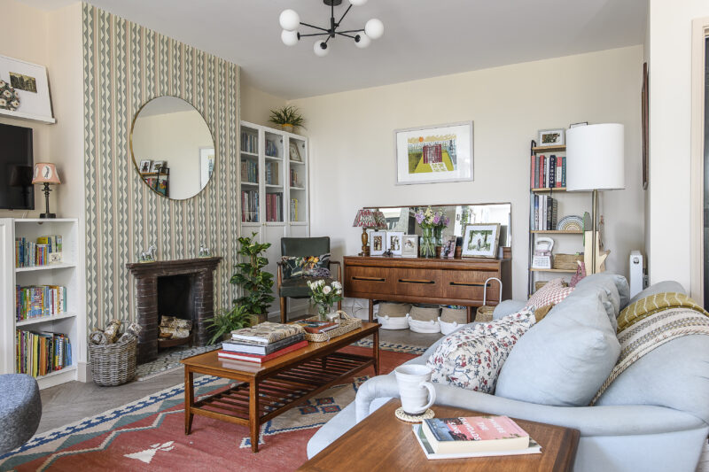
Zoning the space with paint, a rug or even a stylish play mat can help. Utilise the walls as best as you can with storage such as book racks, a fold-down desk, or wall-hung storage. A blackboard wall is another great solution, allowing the kids to get creative while you cook, or utilise the end of the island, whether that’s adding a small desk that can double up as a table for mealtimes, or even a play kitchen of their own.
How can you design a room that adapts with a child as they grow up?
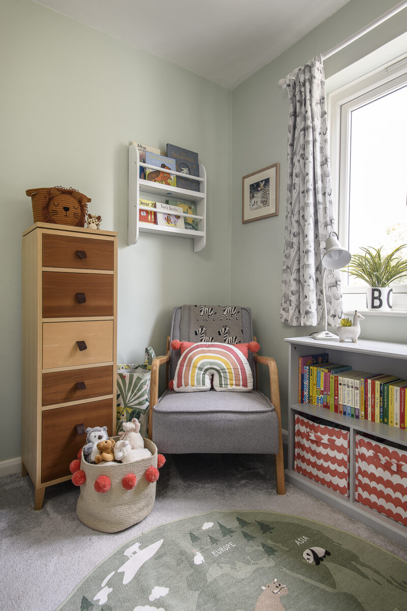
Go for a neutral base and invest in good-quality furniture that won’t date, but is also robust enough to deal with wear and tear. Solid timber pieces that can be re-sanded and painted again and again are a good bet.
Which Oak Furnitureland products do you think would work well in a kids’ bedroom or family-friendly spaces?
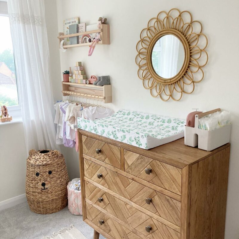
Parquet chest of drawers | @hoptroffhome
I think for kids’ rooms, especially nurseries that end up being the box room or on the smaller side, a tallboy like the Hove or the Parquet with plenty of smaller drawers for separating things like vests, sleepsuits, tops and bottoms, is a great alternative to a conventional three-drawer chest, taking up less precious floor space.
Equally, a smart hallway storage solution such as the St. Ives unit keeps family coats and shoes neatly stowed away and keeps this high-traffic area clear from clutter.
To find out more about Charlotte, visit her website at luxfordinteriors.com and follow her on Instagram @luxfordinteriors. For more on Nest Magazine, follow @nest_magazine and visit nestmagazine.co.uk.

