Whether you’re about to start a big project or just want to update a room in your home, Instagram is a great source of interiors inspiration.
To help you get started, we chatted to brand content creator Lily Sawyer of @layered.home to find out how she approached her recent bedroom renovation. Plus, Lily shares top tips for how to add your own style and personality to your home. So, grab a cup of coffee, take a seat and prepare to be inspired!
Can you tell us a bit about your background?
I’ve always loved being creative and trained in fine art. I did a BA and MA and then decided to pursue a career in teaching in higher education with my post-graduate. After seven years, I started a family and decided to give it all up! But, I guess creativity was always calling and I became a photographer and then a window opened in interiors.
In 2017 I started my interiors Instagram account which led to where I am now – working with brands on their product styling and promotions on social media. It’s been an insightful ride having worked with over 200 brands in the last few years.
Where did you get your inspiration for your bedroom makeover?
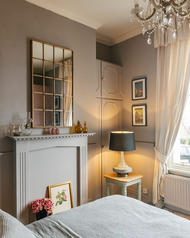
Langham lamp | Brindle side table | @layered.home
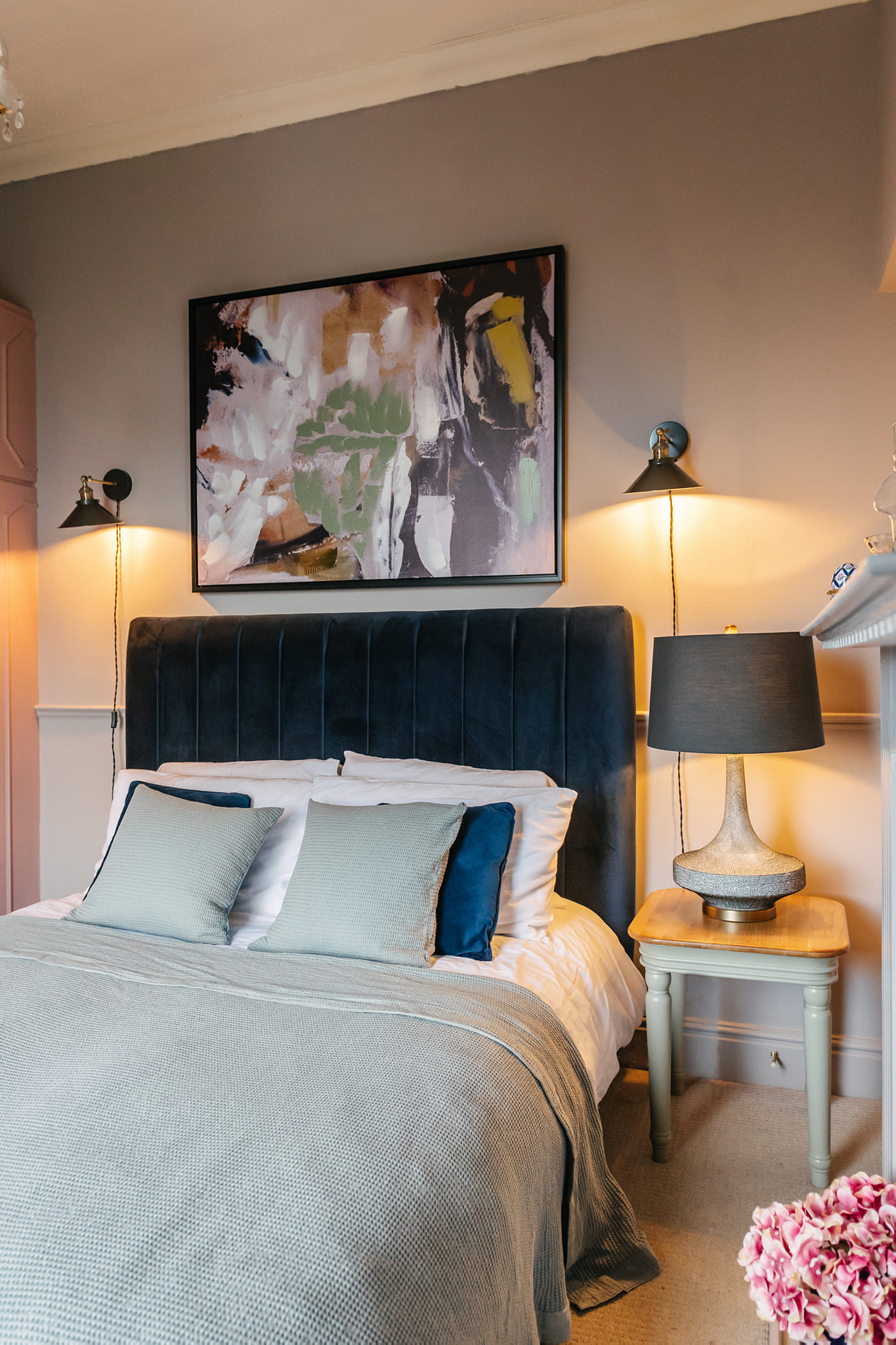
I’m not one who rushes into ripping things off. I guess I’m a recycler at heart and want to first consider any recycling options before replacing anything. For this room, I wanted to keep the character features and juxtapose them against more contemporary furnishings like the velvet bed, big modern lampshade, the large-scale artwork and the mirror.
Having a bit of contrast here and there adds soul and dynamic in any interior scheme. Bringing together styles from different periods adds an eclectic touch and also increases interest in any space.
What are your tips for planning a room overhaul?
I always start with how you want the room to feel. Just because the house may be a period property doesn’t mean you have to stick to that period alone in terms of design. I think you should create a space that is right for you regardless of trends and style.
How you want to feel when you’re in the space, the kind of emotions you want the space to evoke… these are my starting points when designing a room from scratch.
Do you moodboard in advance?

Most of the time I do. I’m a visual person and it helps me to actually see things side-by-side or in the same space. I often envision things in my head but when I put them down on a moodboard, they don’t work! So moodboarding gives me confidence that my choices are right for what I’m trying to achieve. Besides, it’s also a creative and fun thing to do!
Do you have any advice for how to make a space feel unique to you?
I know inspiration and influences are all around us. My advice is to get inspired and be wise on choosing who and where to be influenced by. Don’t do things purely because they are trendy; chances are they are not going to last long. Instead, do what is right for you and what brings you joy.
Why did you choose these particular Oak Furnitureland pieces for your bedroom project?
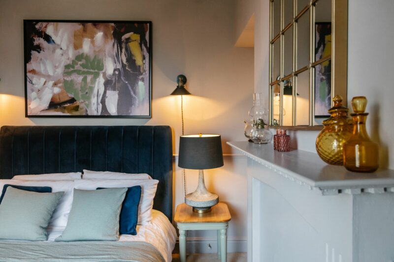
Langham lamp | Brindle side table | Hope painting | Madeline wall mirror | @layered.home
I wanted this room to have a soft, calm feel and big black furnishing would not be right for it so I chose the gold Madeline wall mirror. I love that it is tall and fills in the space between the high ceilings. It is also a statement piece above the mantle and the gold finish really draws the eye in.
However, smaller touches of black are needed to act as various points of contrast dotted around the room to lead and invite the eye to explore the space. I love how the Langham lamp does exactly this and it’s such an elegant shape too. The black on the large scale Hope painting acts as another punctuation to pause the eye, causing it to linger and take in the design for a moment.
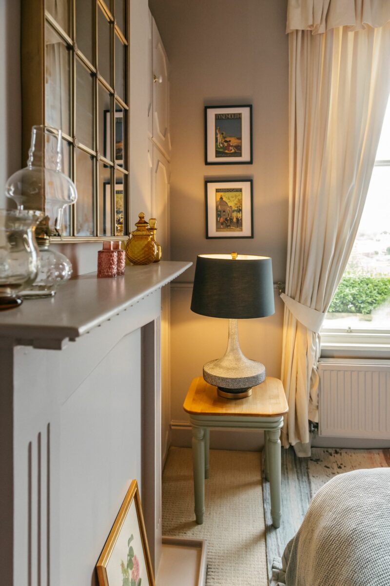
Brindle side table | Langham lamp | Madeline mirror | @layered.home
To continue the theme of contrast, I chose the traditional style Brindle side table in traditional duck egg colour. It is a quiet piece that ties in with the calmness of the room.
How do you style empty walls?
You can never go wrong with some sconces and art. I have evolved a bit and now like my gallery walls to be more orderly and less higgledy-piggledy. I love maximalism but without the clutter.
What’s your advice for creating good images and video content for Instagram?
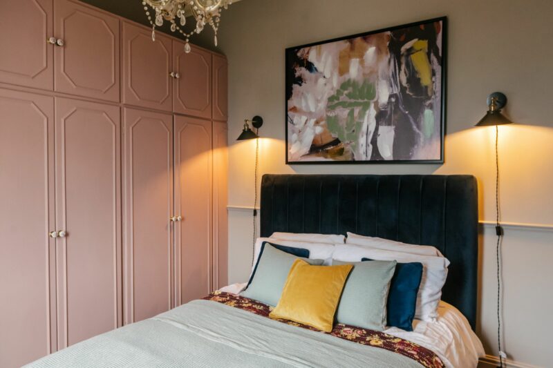
Strong images need to capture attention and interrupt pattern. This could be achieved via angles, colour, composition and textures. Videos nowadays need to be really short, 5-20 seconds are usually enough!
Which other Oak Furnitureland pieces would you love to use in your home and how would you style them?
I am feeling the classics at the moment and you have plenty of beautiful classics to choose from. I love the Mira and Dorchester lamps; they’d go in any room, any design.
I adore this piece of art, it’s so striking and sure to catch attention. You can never go wrong with a touch of black and white! This will sit perfectly on any wall.
Thanks to Lily for sharing her expertise with us, we hope you are full of ideas for your next home makeover. Discover more of her beautiful home on her Instagram @layered.home or visit her blog layered.home.lilysawyer.com. And, don’t forget to follow Oak Furnitureland on Instagram as well.

