Fresh from a trip to the Maison&Objet international trade fair in Paris, we chatted with our Head of Visual Merchandising, Ceri Morgan, to find out the key trends she spotted at this must-visit biannual trade fair that showcases the latest in design and decor.
Read on for interiors inspiration and trends that you’ll most definitely see translated into the world of furniture and homeware retailers in the coming months and years.
Why are shows like Maison&Objet important for furniture and homeware businesses?
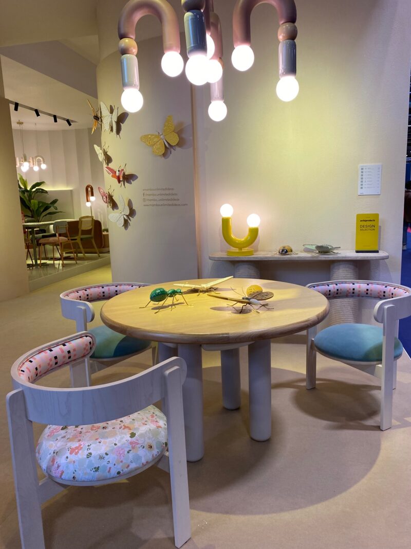
Trade-only expositions and events are key for any retailer or industry specialist to attend. There are networking opportunities with suppliers, competitors and other creative minds across the industry, and of course acres of inspiration in one place.
Before Covid, it was standard practice to meet in person and visit suppliers, and although technology has bridged the gap, long term there is no better way to create rapport than having a conversation face to face. Not forgetting the chance to listen to industry experts talk through relevant topics and give their views and experience to a wider audience.
For creatives, there’s so much for the eyes to feast on, with emerging trends, textures, colours and materials presented in brilliantly innovative ways. I’m always quoted saying: ‘if you come away with even just one gem of an idea, the visit is totally worth it.’
What are the key trends you saw at this year’s show?
Maison&Objet is a highlight on any visual merchandisers’ annual events calendar and it was brilliant to be back for the first time since Covid. I clocked up 27,000 steps over the two days I was there! There were lots of great design elements presented across the impressive displays, and these looks were some of my key takeaways from the show:
Neutrals & naturals
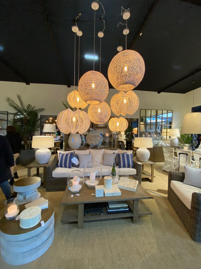
Think Japandi with an even more rustic, textured vibe. Beautiful natural ratans, woven materials and plant-based fabrics.
Ergonomic features
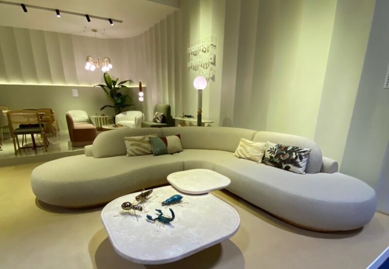
I spotted lots of curves in furniture and chairs specifically. There were very Conran- style elements that ooze retro design and functionality.
Monochromes
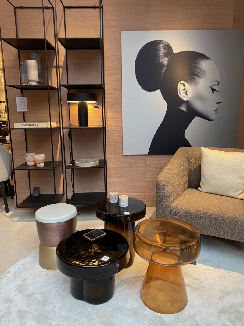
Think clean lines, simple use of tones and bold blocks of colour, again a bit of a nod to the 60s, but with a modern twist. Pattern combinations were strong in this space.
Fluro brights
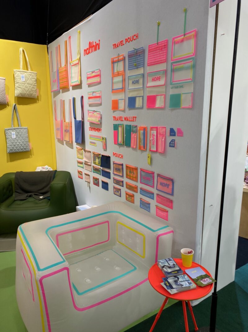
A throwback to my childhood and teens, we saw fluro bold brights used across large-scale statement features and quirky props.
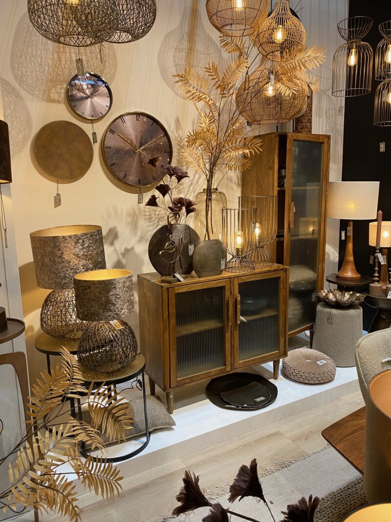
Golden blushes
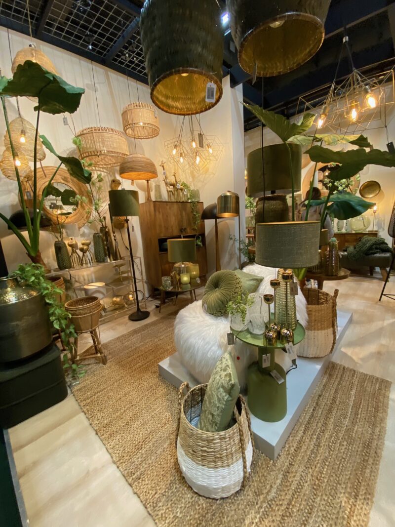
Gold and copper were featured heavily, especially paired with beautiful rusty and earthy hues to create luxury with a hint of rustic texture.
Do you have a favourite of these trends?
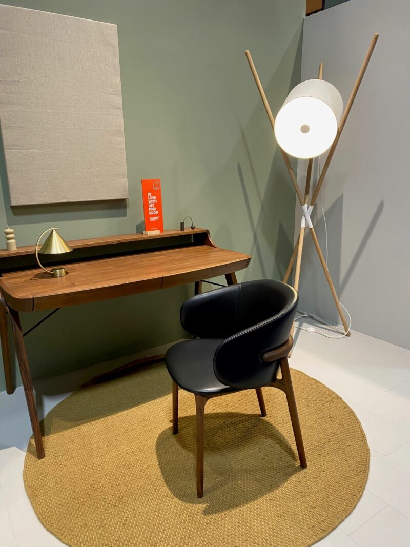
It’s hard to choose as all have their time and place to shine. I’m a retro fan, I love my Ercol sideboard that was my late gran’s. It was certainly built to last!
I’m not afraid to mix old and new and have fun with interiors – this goes back to my fashion degree and love of style and design. Plus, an eclectic mix of items adds a level of personal nostalgia, so my vote goes for the ergonomic, retro trend.
Are there any particular looks that will work well with Oak Furnitureland pieces?
Oak furniture is timeless and therefore can be styled to suit most tastes. Natural wood furniture works brilliantly with neutral colours and natural textures to create a calm, tranquil, softer environment. Bedroom spaces are often a great place to do this.
Gold, blush and copper can create a feeling of warmth in a room, especially when used on walls and in larger accent elements such as rugs or chairs, and works well with many furniture colours, both natural and painted.
We are working on transforming the visual merchandising of the roomsets in our showrooms to reflect different looks and appeal to our customers’ style preferences.
You will see this translate over the next year as we want to ensure that the styling in our beautiful lifestyle photography aligns with the showroom styling to offer a seamless customer journey experience.
What are your tips for introducing trends on a budget?
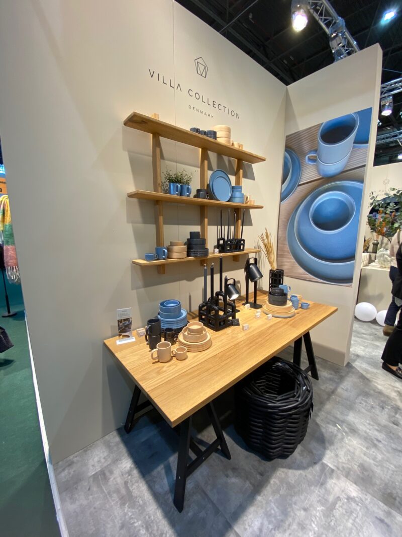
Accessories are the best way to inject some newness on a budget. If you have timeless pieces of furniture and soft furnishings you can update a whole room using cushions, artwork, ceramics and curtains.
This way, you get a whole new look and feel without spending on the big-ticket items again. The trick is to invest well in the foundation pieces so they last – this is where Oak Furnitureland is ahead of the competition as our furniture combines great quality that will take you through life’s moments.
The throw-away generation has the perception that value equals cheap price points and fast-fashion items. However, we believe value should be judged more on how well something is made and how long it lasts, with a focus on quality and longevity.
Thanks to Ceri for sharing her expert opinion. We can’t wait to see these trends in the showrooms. We’d also love to see how you style them with your Oak Furnitureland pieces. Share your homes with us by tagging #OakFurnitureland on Instagram.

