The hallway is arguably one of the most underused rooms of the home, yet it’s the first thing that both you and your guests see when they walk through your front door. You want to make your hallway sing, after all, it is the transitional space between the great outdoors and the comfort of your home.
To help you make the most of your entrance space, we’ve put together some useful tips so that you can maximise your hallway’s potential.
How to measure your hallway space
We all know that hallways aren’t typically the largest room in the home, but that’s not to say they still can’t be home to some of your favourite furniture pieces. Before going ahead and designing your hallway style, it’s worth taking some time to measure the floor and wall space that you have available. Either note these measurements down and map them to scale on a piece of paper, or alternatively use masking tape or cardboard, if the floor is carpeted, to work out your new furniture arrangements.
The most important thing to note when measuring up your hallway for furniture is to ensure that you leave enough of a walkway. Ideally you’ll want around 60-75cm between furniture pieces, or between furniture and opposing walls, to allow for comfortable movement. Bear this in mind when choosing the width and length of your console tables or hallway units.
Use narrow storage features

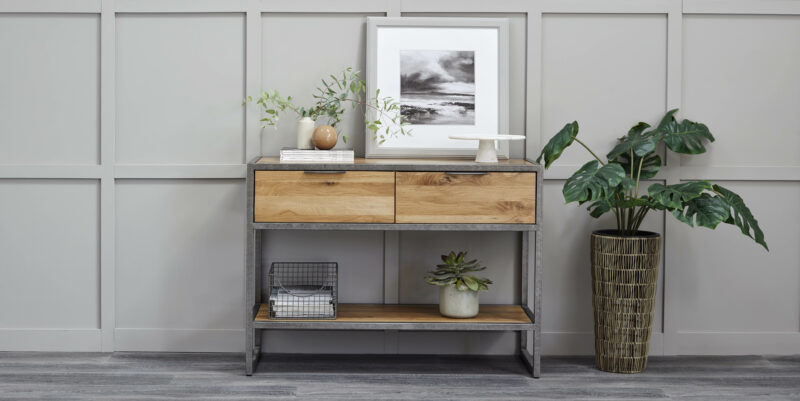
Carefully select pieces for your hallway that suit its size and layout. Choose gorgeous narrow pieces, such as the popular console table, to bring character to your hallway, as well as somewhere to pop your keys when you walk through the door.
The last thing you want in the entrance to your home is clutter; console tables provide a fantastic space to tidy away important items, while also preventing the hallway from looking too empty!
You might also consider popping a hallway unit in. A tidy place for your coats, bags and shoes, as well as a seating spot to help you get your shoes on and off, it’s a great stop off point on your way out and into your home. Not only are they extremely functional and space-saving, our Canterbury hallway unit brings real personality and style to this very functional space.
Find space under the stairs
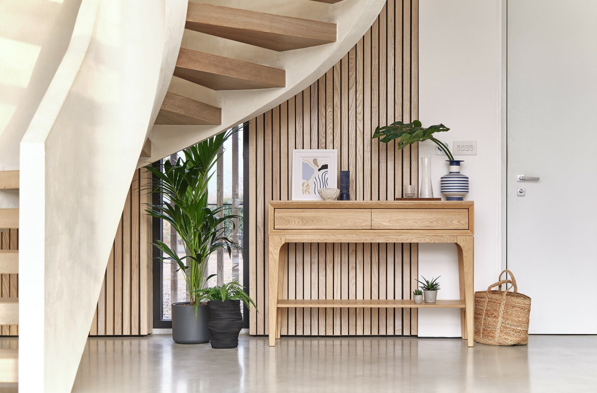
When working with any space, you really want to maximise any areas that you have at your disposal. If you have stairs in your hallway, it’s important to remember that under the stairs is not wasted space! If it’s already been made into a cupboard, why not use it to tuck away your coats and shoes, and clear the space of clutter? If it’s free and gives more floor and wallspace, why not see if a console table will fit, or alternatively shoe storage and hooks?
Light up your entrance

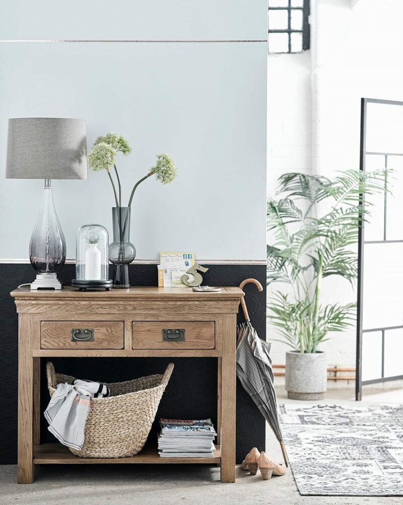
French Farmhouse console table
An often overlooked element of hallway design, lighting is extremely important to the look and feel of your entranceway. Choose brighter lighting to create the illusion of space in what is often a dark room of the home.
If you’re working with a narrower hallway, opt for wall sconces, or even spotlight lighting in the ceiling, so as not to add clutter to the space. But, if you can afford the ceiling space, create glamour and luxury from the offset and choose an eye-catching ceiling pendant light to welcome your guests.
Why not also choose a statement lamp to place on your console table for some extra warmth and style?
Create space with mirrors
The sentiment is age old, but adding mirrors can really make a small space feel bigger. As hallways are often darker, a mirror can also help reflect the light, making a previously gloomy room brighter, airier, and more inviting. Choose from stylish circular mirrors, or bold, large wall mirrors within our ranges.
Be bold with colour
When working with a smaller space such as a hallway, many people think bright neutral colours will help to create the illusion of more space. It’s actually recommended to be more bold with your colour choices, adding pops of colour to keep your entranceway looking interesting and exciting.
If you’re working with quite a dark space, darker colours can actually make the room feel bigger. Painting a gloomy hallway white can accentuate the lack of light, so stronger colours may be more appropriate.
Why not also paint the ceiling? Using the same colour paint for your walls and ceiling elongates the space, making your hallway seem deeper and more spacious.
Keep it minimalist

The most important thing to remember when designing your hallway layout is to keep it as minimalist as possible. Counter-intuitively, this might mean adding furniture to hide away clutter. While some might be working with large spaces that can take multiple pieces of furniture and design features, hallways are typically the smaller and narrower rooms of the house. Keeping it clutter free will help to create a sleek, stylish and welcoming entrance for both you and your guests. So, if you’re someone that likes to have a lot of your favourite items on display, it might be worth keeping these for the other rooms of your home.
You should now be ready to make your entrance the best possible greeting to anyone walking through the door! Browse our hallway furniture pieces to find the perfect style for your home.

