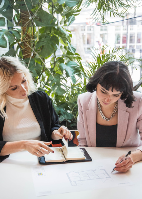
Athina Bluff is one half of interior design duo, Topology, an award-winning interiors blog and online design service based around affordability. Along with her co-founder Amy Brandhorst, they set up Topology as they know that great style doesn’t have to come at a cost, and are on a mission to share their top tips, style secrets and blogger gossip.
We sat down with Athina to get the inside scoop …
Tell us a little bit about yourself and how you got into interiors?
I’m Athina, 27 yrs old and I live with my boyfriend & pet puppy Sasha and I co-run Topology Interiors. Topology is an affordable interior design company mainly but we also host workshops & run an award-winning blog – voted ‘Best Interior Designer Blog’.

I worked in the luxury furniture industry for 4 years and fell in love with the interiors side of things and naturally progressed into designing spaces. We’ve done cafes, showrooms, show homes, residential properties, you name it. I started Topology back in 2016 and it’s been really well received.
What do you love most about your job?
The freedom to work on my own time and that every day is different. Some days I’m office based in our co-working space in Clerkenwell but other days I’m rushing around the high-street shopping for clients, carrying mattresses upstairs(!), writing blogs, speaking with tradesmen or going to press shows.
It’s a very diverse job and can be extremely stressful so I make sure I start the day right with a cup of coffee & a walk in the park.
Where do you gather inspiration?
Literally everywhere – Instagram, Pinterest, books, wandering around streets, magazines. I went to Lisbon recently and found the cityscape so inspiring in terms of colour combinations – I took some pictures as want to use one of the combos I saw in a future project.
What are you working on at the moment that you can share with us?
We’ve just finished a big job in Coventry which was a two bed Airbnb – it was different to usual as you had to go down to the nitty-gritty details like cutlery & pillow protectors, so you can imagine the organisation involved, but we got there in the end. Hopefully the client whose a developer wants to hire us to do 6 more…
What’s the best interior design lesson you’ve learnt?
Check access into your property before making big purchases – this is the no. 1 thing people fail to think about at when placing orders for big pieces of furniture.
What’s the best advice you’ve ever been given?
Paint the skirting boards – it just gives the room an entirely new sense of sophistication and is very simple to do.
How would you describe your style at home?
It varies depending on the client but there’s definitely an element of Scandi in there & muted tones. I’m not a fan of busy, cluttered or overly colourful designs – I find them stressful to look at. I’m all about creating a sense of calm.
How would you describe your interior design style?
Laid-back scandi with a hint of Soho home.
What’s your favourite piece in your home?
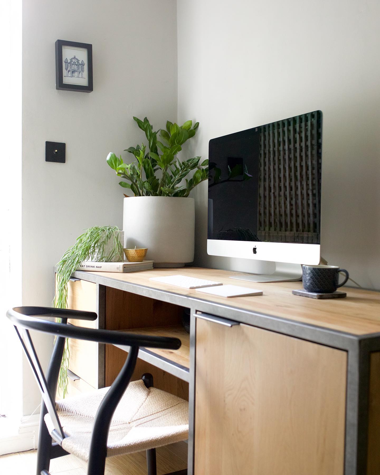
Well, I’m currently loving my Oak Furnitureland desk from the Brooklyn range. In fact, I’m writing this using it right now.

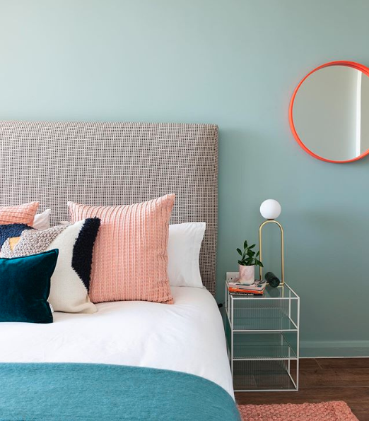
But I’m also obsessed with my linen bedsheets from HM Home – I don’t usually spend £100 on linen but I couldn’t resist & I’m so glad I invested as they’re so soft I never want anything else on the bed. I’ll take them with me from home to home and have them forever.
What was the last thing you purchased?
Some paint from Farrow&Ball called Sulking room pink for my hallway, take a look at how it turned out below.
What are some of your best styling tips?
- How people can create a beautiful look on a budget
Firstly, work out what your investment pieces are first e.g. flooring, sofa, bed etc and then calculate what budget you had leftover. From there, see which items you can be frugal on meaning you’ve got budget to spend a little extra on some statement pieces. Also, don’t be afraid to go second-hand shopping or go to places like eBay or Gumtree. - How to decorate a room so that it can evolve with different trends and is easy to update
Buy timeless, perhaps neutral pieces, which can be mixed with different accessories easily to update with trends.
What is the best way to decorate a small room to create the illusion of space?
Depends on how much light it gets. If it gets a lot of natural light, a light wall colour will keep it looking light & airy. If it doesn’t get a lot of light, a darker colour will actually work better as blurs the boundaries of the room making it appear bigger. If you did paint it say white, the corners of the rooms end up looking dingy & dark.
Also, use weightless/transparent furniture so that you can see as much of the room around your item. E.g A bed or sofa that sits off the floor so you can see underneath it, or a glass dining table to see through & around it. This will create an illusion of space and also allow more light to travel around the room.
A few quick tricks I use are…
- For larger spaces, go darker
- For small spaces, add as much storage as possible to prevent clutter
- For renters, don’t be afraid of asking the landlord if they’re willing to put some of their furniture in storage so you can buy your own
- Update kitchen cupboard handles to something more snazzy
- Update your switches and sockets for a real punch that you never considered would make a difference
- Use tile grouting pens to give old grouting a new lease of life – seriously works!
What are your must-have tools as an interior stylist?
Uni-bond ‘click & fix’ – a no nails adhesive that can put anything up without drilling holes. great for things like shelves and mirrors.
Do you have any particular advice for creating certain rooms?
Consider these elements in a room:
- What it’s primary function is and how it will be used
- How much light it gets all day round
- What it’s architectural features are
Once you’re clear on these three things, design your room bearing these key ingredients in mind.
What are the big interiors trends you’re seeing at the moment?
We’re flocking back to the ‘light side’ – after dark interiors taking over for such a long time. I think it’s only natural that people are reverting back to lighter wall colours as they’re more uplifting.
Also – lots of spheres, arcs, circles etc – these sorts of shapes represent balance & harmony, so again I think this trend is a reflection of wanting our spaces to feel calm.
Finally, what are the trends you’re most excited about at the moment?
Bringing the indoors out – I love the whole make your outdoor space an extension of your living room – cushions, throws, lanterns, outdoor cinemas – right up my street.
Follow Topology on Instagram or head over to their website to see more of their great work.


