For the last 17 years, the global paint powerhouse Dulux has announced its colour of the year, providing a hero shade and complementary colour palettes that will suit different styles and work effortlessly in different rooms across the home. In 2018 Dulux introduced Heart Wood, a beautiful soft pink shade and then in 2019, the rich, warm Spiced Honey took centre stage.
In 2020, an expert panel of colour designers, design specialists, trend forecasters, architects and editors have handpicked Tranquil Dawn as the hero colour of the year. Inspired by the morning sky, this versatile shade of green brings nature into the home. If you’re looking for serenity, incorporate Tranquil Dawn into your home design using four unique colour palettes.
A home for care
Source: Dulux
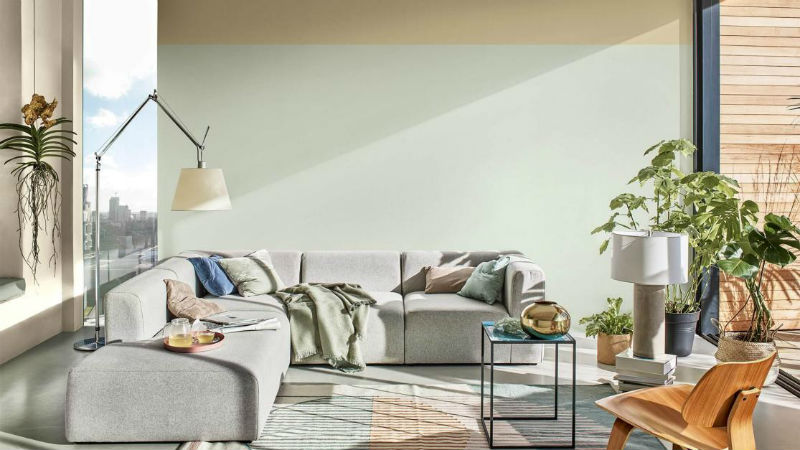
This living room blocks out the hecticness of modern living, only allowing serenity to billow through the door. The furniture is beautifully simple: a modular corner sofa, angular fixtures like the lamp, minimalist accessories and leafy houseplants. Tranquil Dawn is the primary colour on this palette, with the other shades fitting around it.
Source: Dulux
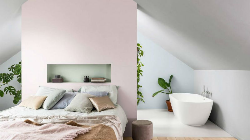
Tranquil Dawn exudes calm and clarity and the room you’ll most want to achieve this mood in is the bedroom. Here, Dulux uses Tranquil Dawn as an accent colour, threading it throughout the soft furnishings among the Faded Damson feature wall, Misty Mirror ceiling and Borrowed Blue bathroom wall.
We agree that an open plan bedroom-bathroom is the essence of home tranquillity, especially with a sublime stand-alone bathtub. In our Mindful Relaxation bedroom, you can use a beautiful green-grey as the primary colour for your walls while using tonal charcoal and navy blues for depth, adding a flash of pink on the recesses to demarcate different spaces, whether these are partially or fully knocked through.
A home for play
Source: Dulux
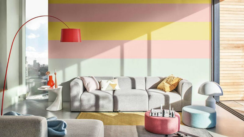
There’s plenty of room for playfulness with this range, however. Go kaleidoscopic with a multi-hued wall; Dulux have decided on bands of Citrus Zing, Ballerina Dance and, of course, Tranquil Dawn. To not go too overboard with pastel, keep your central furniture pieces monochrome and accentuate with pops of colour in the accessories.
Feature walls are a favourite of ours. Do something different with yours and incorporate a geometric pattern. We’ve used a sorbet palette for our reading nook, using grey as the central colour and intersects of lemon, lime and tropical tinges, subscribing to hot geometric trends.
Source: Dulux
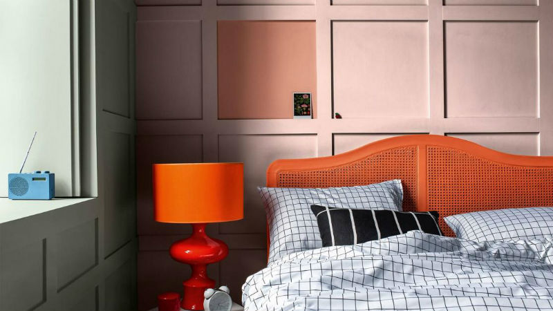
Inject warmth into your home in what feels like a homage to Spiced Honey. Here, Copper Blush and Ballerina Dance are the sources of heat, whereas Tranquil Dawn provides a completely unique offset. It, paired with the hot orange furnishings, shouldn’t work on paper but, in principle, looks sleek, stylish and very impressive.
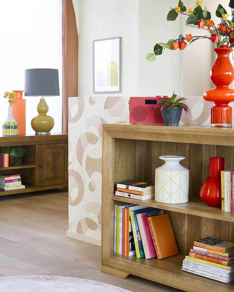
Bevel small bookcase | Hercules large TV unit
We also can’t quite let go of Spiced Honey and it appears to reincarnate in our Spiced Curves trend via the natural and rustic oak furniture of our Bevel and Hercules ranges and the neon flash of our ornaments and accessories. Yet, a colour like Tranquil Dawn works wonders here, cooling down the flush of colour.
A home for meaning
Source: Dulux
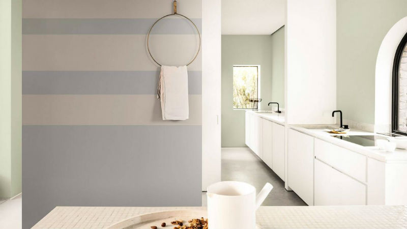
If the modern gleam of your kitchen feels a bit too clinical, a touch of paint can add an aura of luxury and plenty of texture. Dulux keep things simple with three shades of grey – Calm Clouds, Pale Taupe and Chic Shadow – which give Tranquil Dawn plenty of room to shine.
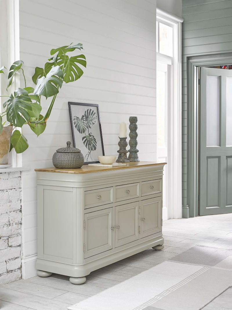
In our kitchen-diner, we’ve gone for green all over, the different tones bouncing the visitor’s eye around the room. The real-life philodendron and its framed counterpart provide a mirroring effect, while all the room’s interiors – from the doorframe to the walls, to the door itself – are lathered in a beautiful shade of green. This makes the sage-painted Brindle sideboard feel right at home.
Source: Dulux
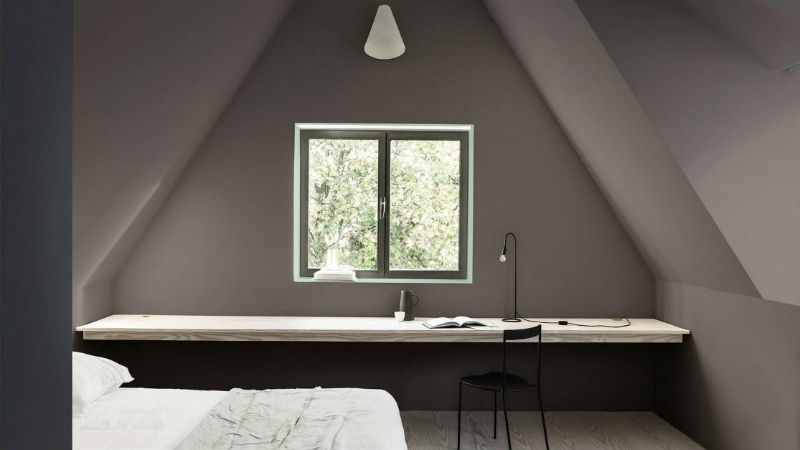
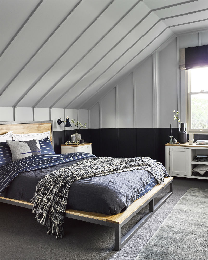
Slanted ceilings in an attic room can make a room feel cramped so, a clever way to create the illusion of space is by reducing shadows and contrast so eyes are drawn to one end of the room. Using a combination of Damson Dusk and Cobalt Night, Dulux creates a moody effect, directing vision towards a natural light source, accentuated by an illuminating border of Tranquil Dawn paint.
Brooklyn king-size bed | Hove bedside table | Hove large TV unit
Our Scandinese bedroom achieves the same effect in a different way. By painting a two-tone wall, we encourage eyes to move upwards, away from the dark border and to the ceiling, a much lighter colour that looks especially striking using intonations of blue, green or grey (or Tranquil Dawn, a moulding of them all).
A home for creativity
Source: Dulux
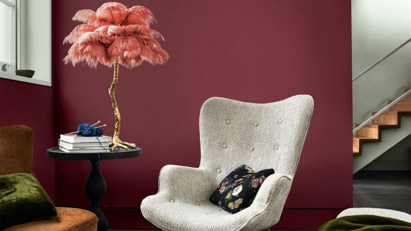
Colours like deep burgundy and luscious forest green are really atmospheric and cosy but they can often be too intense for an all-over look. That’s why Tranquil Dawn is so effective – see it on the window sill and beyond the knocked-through wall? The contrast is both gentle and calming while remaining opulent.
This is a perfect colour palette for a quiet corner of your home, somewhere to recline and catch up on your reading. A deep red brings the drama whereas an adjoining wall of softer green will provide that well-needed subtlety.
Source: Dulux
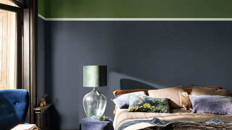
Though red is, well, red hot, the same contrasting effect works with ultra sumptuous blues. The Sapphire Splendour with a glimmer of Tranquil Dawn is pared-back style at its most sophisticated; the luxurious bedding and opaque accessories pulling the look together.
Brighton chaise sofa | Brindle large sideboard | Brindle side table
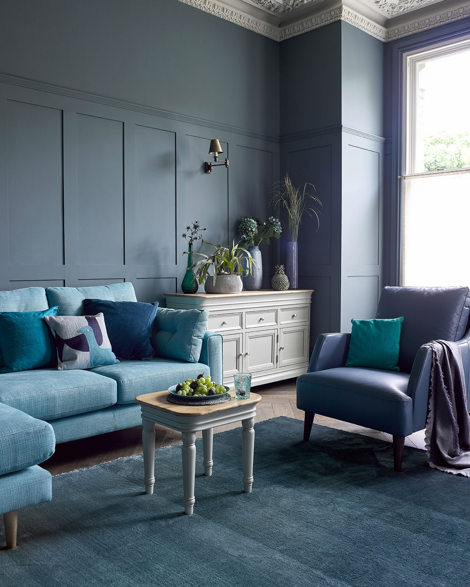
In our mirroring palatial living room, Tranquil Dawn-like shades can be found among the ocean of seaspray shades in the form of our Brindle range of painted furniture. Its delightful green-grey finish and ornate curves are topped by natural solid oak to bring the beauty of nature into an otherwise single-colour design scheme.
Now it’s your turn. Are you a fan of Dulux’s Choice for Colour of the Year? If so, how will you be using it in your home this year? Let us know how you’re styling it in your home using #OakFurnitureland on Instagram
